Statistics are more relevant than ever in this digital age, where data about our entire lives is readily available, and software to analyze such data has become extremely user-friendly and freely available. We live in a world where organizations large and small collect data to tailor products and services, and being data literate is becoming increasingly important across industries.
Statistics allows us to make sense of data and gain valuable insights. It helps us better understand social phenomena, predict sales and optimize marketing strategies, and even explore the relationship between brain activity and behavior. Data analysis is one of the most marketable skills taught at universities.
Before we delve deeper into statistics, it’s crucial to distinguish between methods and statistics. Methods refer to the procedures used in research, such as data collection, participant selection, and study design. Statistics, on the other hand, focuses on analyzing the data obtained from these methods.
Two fundamental branches of statistics covered in this course are descriptive statistics and inferential statistics. Descriptive statistics involves summarizing and describing the characteristics of a dataset, while inferential statistics allows us to make educated guesses about a larger population based on a smaller sample.
Statistical modeling is another aspect of statistics where theories are represented mathematically. This enables us to predict important outcomes, such as sales figures, well-being, or the likelihood of neurological disorders. Statistical modeling also allows us to explore data for interesting patterns or to perform tests to answer theoretically driven research questions.
In scientific research, statistics can help us test theories. The process of scientific knowledge acquisition is described by the empirical cycle: We start with a theory, from which we derive testable hypotheses. A theory is an abstract system of assumptions about the relationships between constructs. A hypothesis is a concrete statement, derived from the theory, about expected quantitative relationships between measured variables. We then collect data and test the hypothesis. If the hypothesis is refuted, we re-examine the theory and possibly amend it.
To lay a foundation for understanding statistics, it’s essential to be familiar with some basic concepts. First, data in the social sciences often come in tabular format (e.g., spreadsheets), where each row represents an individual observation, and each column represents the individuals’ scores on various variables.
3.0.1 Population and Sample
A crucial distinction is the one between population and sample. The population refers to the complete set of objects of interest, such as all people in a country or all students in a class. However, due to practical limitations, we usually do not have access to the population. Instead, we draw a sample from it, which is a subset of the population. Sampling theory establishes the rationale for drawing inferences about a population based on samples. Sample statistics serve as our best estimate of population parameters. If the sample is representative, those estimates will be unbiased. Moreover, we can estimate our uncertainty about the sample statistics as estimates of population parameters. The best way to ensure a representative sample is to use random sampling, where each individual in the population has an equal chance of being included—though in practice, constraints often lead researchers to rely on convenience or stratified sampling, which can limit the strength of our inferences.
The distinction between constructs and variables is also important. Constructs are abstract features of interest within a population, like short-term memory, intelligence, or education. Variables, on the other hand, are placeholders that represent specific values associated with these constructs—much like column headers in a spreadsheet. Data then refer to the specific values of a variable.
3.0.2 Measurement Levels
Measurement level refers to the kind of information contained in a variable. The four common measurement levels are nominal, ordinal, interval, and ratio (NOIR). Each subsequent level of the NOIR taxonomy carries more information than the previous level, thus permitting different comparisons and statistics.
Nominal variables sort cases into categories with no inherent order (e.g., academic major, country); you can count them, calculate proportions, and the mode). Ordinal variables have a rank order but not equal spacing (e.g., Likert agreement, socioeconomic status quintiles). You can use them to calculate medians and percentiles. Interval variables have equal spacing between units, but no true zero value (e.g., temperature in Celsius, calendar year). Differences between values on an interval scale are therefore meaningful, allowing for the calculation of means, standard deviations, and Pearson’s correlation coefficient. You can apply a linear transformation to an interval scale (e.g., \(a + b*X\)), but ratios between values on an interval scale are not interpretable (20 degrees Celsius is not twice as hot as 10 degrees Celsius). Ratio variables have equal units and a meaningful zero (e.g., income, reaction time, number of friends); both differences and ratios are meaningful.
In practice, researchers sometimes treat coarse ordinal scales (e.g., 5‑point Likert scales) as interval (or even ratio) for convenience’s sake. This is a pretty strong assumption about measurement level.
3.0.3 Descriptive Statistics
Descriptive statistics are used to summarize and analyze data. They help us get a sense of the dataset and answer questions like the most common major among students or the average age of a group. Descriptive statistics can also be relevant in answering research questions, such as evaluating exam questions or determining if the proportion of correct answers on a multiple-choice question is greater than chance.
3.0.4 Study Design and Validity
Researchers employ several study designs to collect data, for example, experimental, quasi-experimental, and observational studies. Each has its own strengths and limitations. The quality of study designs can be evaluated along two dimensions:
Internal validity: the credibility of a finding within the context of the study. To what degree does the study design rule out alternative explanations for key findings? In the case of an experiment, for example, can observed differences in outcomes between the experimental and control condition be attributed to the manipulation rather than to alternative explanations such as confounding, selection bias, measurement error, history/maturation effects, demand characteristics, noncompliance, or interference between units? Methods to increase internal validity include: Random assignment, using pretests/pilot studies, reliable instruments, blinding experimentors, participants, and coders (where feasible), manipulation checks, preregistration, and management of participant drop-out.
External validity: the extent to which findings generalize beyond the specific sample, setting, and operationalizations used in the study. It is threatened by, for example, using convenience samples and artificial laboratory tasks that do not resemble the real world (low “ecological validity”). It can be strengthened through random sampling, conducting experiments with high ecological validity, such as field experiments, and conducting conceptual replications (using different methods to find the same effect). A tightly controlled laboratory experiment may score high on internal validity but lower on external validity, whereas a large-scale field survey often shows the opposite pattern. Balancing both is a central concern of scientific inquiry.
3.0.5 Ethics, Privacy, and Reproducible Workflows
Modern data analysis carries legal and ethical responsibilities. Ethical social science research involves protecting participants’ autonomy, welfare, and privacy. In the EU, the GDPR legislation requires researchers to establish a lawful basis for processing participants’ data (which can include informed consent). Informed consent - participants agreeing to participate in the study and share their data after receiving information about the study and purposes of data collection - must be freely given, specific, and unambiguous Finally, there have been concerns about a lack of reproducibility in the social sciences and many other fields. By some estimates, as many as 70% of published research findings cannot be independently reproduced. Contemporary practices in social scientific data analysis seek to address this issue. For example, preregistration and registered reports are used to demarkate confirmatory hypothesis tests from exploratory data analysiss. Many researchers also produce reproducible code for their analyses (which can be done in SPSS by generating syntax, instead of running analyses interactively). They sometimes create “replication packages” or “reproducible research archives” that contain the data and code to produce the results, so that other researchers (and sometimes, anyone) can re-use the code, and reproduce and verify the results.
3.1 Lecture
3.2 Formative Test
A formative test helps you assess your progress in the course, and helps you address any blind spots in your understanding of the material. If you get a question wrong, you will receive a hint on how to improve your understanding of the material.
Complete the formative test ideally after you’ve seen the lecture, but before the lecture meeting in which we can discuss any topics that need more attention
Question 1
What is the primary purpose of statistics?
Question 2
What is the difference between descriptive statistics and inferential statistics?
Question 3
What is the purpose of statistical modeling?
Question 4
What is the empirical cycle in scientific research?
Question 5
What is the distinction between population and sample in statistics?
Question 6
What is the variance?
Question 7
Six students work on a Statistics exam. They obtain the following grades: 8, 9, 5, 6, 7 and 8. The teacher calculates a measure of central tendency, which is equal to 7.5. Which statistic did the teacher calculate?
Question 8
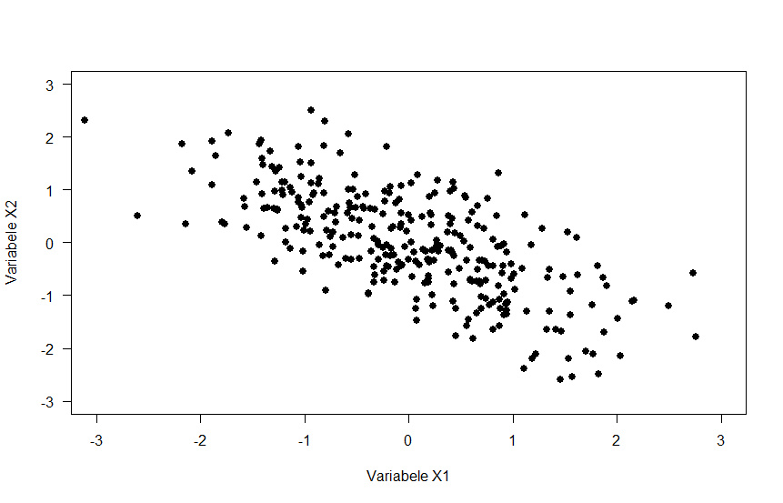
For which of the three scatterplots below is the correlation coefficient strongest?
Question 1
Statistics is the science concerned with developing and studying methods for analyzing data.
Question 2
Descriptive statistics are calculated based on sample data; inferential statistics involves using those sample statistics to make best guesses about population parameters and quantify uncertainty about those guesses.
Question 3
Statistical modeling in particular refers to the process of translating a theoretical model into a statistical model whose coefficients can be estimated using data.
Question 4
The empirical cycle is a theoretical cyclical model of knowledge production through scientific research, whereby theory gives rise to hypotheses, which are tested in data, after which the theory is revisited based on the results.
Question 5
Population refers to the complete set of potential participants, of which the sample is a subset.
Question 6
The variance is the sum of squared distances of observations to the mean, divided by the number of observations minus one. So calculate: \(S_{X}^2= \frac{\sum_{i=1}^nX_i}{n} = \frac{(7 + 6 + 8 + 6 + 8)}{5} = 7\)
Question 7
First rule out improbable answers; the variance is not a measure of central tendency, and all grades are pretty close to each other, so it would be impossible for the variance to be that high. We can see what the mode (most common value) is: it’s 8. So we only choose between mean or median. Mean: calculate \(\bar{X}= \frac{\sum_{i=1}^nX_i}{n} = \frac{8 + 9 + 5 + 6 + 7 + 8}{6} = 7.17\) Median: order the numbers, note that there is an odd number, take the average of the two middle numbers. 5, 6, 7, 8, 8, 9 -> 7.5
Question 8
Correlation measures linear association, so eliminate option C. Option B shows a very small correlation - probably 0 or maybe .1. So the correct answer is A, which shows a moderate negative correlation.
{width = 30%}
{width = 30%}
{width = 30%}
Figure 3.1: Scatterplots
3.3 In SPSS
3.3.1 Instruction Video
3.4 Tutorial
3.4.1 Introducing SPSS
Welcome everyone to your first lab session for Statistics 1 and 2. Today, we start working with an introduction to SPSS and we calculate a few basic descriptive statistics.
Each lab session consists of several assignments and includes explanations on how to carry out the analyses in SPSS.
You can work at your own pace. If you experience any problems, or if you have any questions, feel free to ask your teacher.
You will receive feedback to your answers after you have submitted the practical.
Good luck!
3.4.1.1 Step 1
Hi there!
During the lab sessions of this course you will learn how to work with the statistics program IBM SPSS (SPSS for short).
Background information is given throughout the exercises. We will occasionally refer to additional reading materials for this course, or other sources (e.g., youtube videos).
If you’re working from a student workplace, SPSS is already installed. If you’re working from your own computer, you either have to purchase SPSS, or you can use a free alternative (see ?sec-software) - but note that, at this point, the instruction text is still focused on SPSS so if there are any differences it will be your responsibility to figure out how to use your software.
Your first task is to start the SPSS program. You can easily find SPSS via the Windows Start Menu. SPSS may ask about the coding: use Unicode (button to the left). Then there may be another window open that you can close. In the end you should see an empty spread sheet.
3.4.1.2 Step 2
Now you’ve got SPSS running, we’re ready to go!
We will start with a number of introductory exercises using the data file stressLAS.sav. To obtain this and other tutorial data files, download the GitBook, and open the data folder to find all files.
Open the file in SPSS. Proceed as follows: via the op menu follow the route: File -> open -> data. SPSS now opens a new window. Search for the file stressLAS.sav and open the file in SPSS.
3.4.1.3 Step 3
The file contains data about a study on - you guessed it - stress.
More precisely, it contains data on the following variables:
stress: Measures whether the participant experiences stress, and where the stress comes from.
smoke: Measures the smoking behavior of the participant.
relation: Whether or not the participant is involved in a long-term romantic relationship.
optim: Measures how optimistic the participant is on a scale of 0 to 50.
satis: Measures of life satisfaction of the participant on a scale of 0 to 50.
negemo: The amount of negative emotions on a scale of 0 to 50.
3.4.1.4 Step 4
After opening the data file, you will see the tabs Data View and Variable View at the bottom of your screen.
Make sure the tab Data View is selected.
Look at the Data View and describe the data file. What do the rows represent, and what do the columns represent?
3.4.1.5 Step 5
Now switch to the Variable View tab.
The Variable View lists the variables and their properties. We will not discuss all the columns in detail, but focus on the most important ones, which includes: name, label, values, and measure.
Explain for each of the columns name, label, values, and measure what aspect of the variable it describes. Also explain the difference between variable name and variable label.
3.4.1.6 Step 6
Value Labels
For nominal and ordinal variables we have to indicate what the scores represent; that is, we have to assign so called value labels. Value labels are specified under Values.
If you click on values for the variable of interest, and then on the blue button with the three dots on the right, SPSS opens a new window that allows you to view, define, or modify the value labels.
What are the value labels for the Stress and what are they for Smoke?
3.4.1.7 Step 6a
You may have noticed that the value labels are missing for the nominal variable Relation.
Add the value labels yourself in SPSS such that a score 1 represents “Single” and 2 represents “In a relationship”.
3.4.1.8 Step 7
Every variable has a so-called Measurement Level.
First, summarize the measurement levels in your own words (as if you have to explain it to a fellow student). Then, indicate the measurement level for each of the variables of interest (Stress, Smoking, etc.).
3.4.1.9 Step 8
Congratulations, you have completed your first assignment!
Before we proceed make sure that you save the data file (via file > save). Because you changed the data, it is important to save the file under a different name. This way, you don’t risk losing the original data.
In the next assignment we will generate descriptive statistics for this data.
3.4.2 Plotting data
3.4.2.1 Step 1
The first step in any statistical analysis involves inspection of the data at hand by means of descriptive statistics and/or graphical summaries. Descriptive statistics include the mean, standard deviation, minimum and maximum value. Examples of graphical summaries are bar charts, histograms, and scatter plots.
In this assignment we will look at graphical summaries. In particular, we will look at three: bar charts, histogram, and scatter plots.
You may use the same data file as for the previous assignments.
3.4.2.2 Step 2
First, we will create a bar chart for Stress.
Proceed as follows:
Graphs > legacy dialogs > bar Select Simple and click on define Select Stress under Category Axis (i.e., the variable at the x-axis) Then Click on OK and consult the graph in the output
3.4.2.3 Step 3
You may have noticed that SPSS by default creates a bar chart with the observed frequency depicted on the y-axis. We will now create a new bar chart and instead ask SPSS to show the percentages on the y-axis.
Proceed as follows:
Graphs > Legacy Dialogs > Bar Again choose Simple and click on Define Under “Bars represent” choose “% of cases” Click on OK. SPSS will now create a bar chart, where the heights of the bars represent percentages.
3.4.2.4 Step 4
Next, we will create a histogram for Negative Emotions.
Proceed as follows:
Graph > Legacy Dialogs > Histogram Select Negative Emotions under variable, and ask SPSS to Display normal curve (check the box). Click on OK.
Investigate the histogram; What is shown on the x-axis and what is shown on the y-axis?
How to read the histogram:
x-axis: the scores on the negative emotions (here numbers between 0 and 50). bars represent score ranges; the more respondents with a score in that range, the higher the bar.
y-axis: the observed number of respondents per score range.
3.4.2.5 Step 5
Finally, we will create a scatter plot for Negative Emotions and Life Satisfaction. Scatter plots are very useful to get a first impression of whether variables are associated.
Create a scatter plot as follows:
Graphs > legacy dialogs > scatter/dot Choose Simple Scatter Select Negative Emotions on the x-axis, and Life Satisfaction on the y-axis Click OK
Consult the output. Look at the scatter plot and see if you understand the graph.
How to read a scatter plot:
x-axis represents the scores on Negative Emotions.
y-axis represents the scores on Life Satisfaction.
Each dot in the graph is a case, representing how the case scores on both Negative Emotions and Life Satisfaction.
3.4.3 Quiz
Describe the first bar chart; What is shown on the x-axis?
In the first bar chart, what is shown on the y-axis?
What’s the approximate proportion of people experiencing work-related stress?
Based on the bar charts, what can you say about differences in stress levels in the sample? Are most people stressed or not? In other words: How is stress distributed across the three categories?
Describe the distribution of Negative Emotions. Are the scores normally distributed (i.e., like a bell-shape)? Really consider why this is / is not the case before checking your answer.
Based on the scatter plot from Step 5, would you expect an association between Negative Emotions and Life Satisfaction?
3.4.4 Descriptive Statistics
3.4.4.1 Step 1
As explained before, the first step in any statistical analysis involves inspection of the data. In the previous assignment we looked at graphical summaries.
This assignment shows you how to explore data using descriptive statistics. Descriptive statistics include values such as the mean, standard deviation, the maximum value and the minimum value.
Use the same data file as for the previous assignments.
3.4.4.2 Step 2
We will first take a look at the descriptive statistics for Optimism, Life Satisfaction, and Negative Emotions.
Compute descriptive statistics as follows:
Analyze > Descriptive Statistics > Descriptives
Select the variables Optimism, Life Satisfaction and Negative Emotions Now click on OK SPSS will open a new window - the output window - including a table with the descriptives for the selected variables.
3.4.4.3 Step 3
In the previous step we computed the average value and standard deviations. However, for nominal and ordinal variables, the average value is meaningless. To explore nominal and ordinal variables we may produce Frequency tables. A frequency table shows the observed percentage for each level of the variable.
Let’s generate a frequency table for variables Smoke and Relation.
Analyze > Descriptive Statistics > Frequencies
Select the variables for which you want to have the frequency distribution (i.e., Smoke and Relation) Click OK. SPSS now adds a table with the frequency distributions of the selected variables to the output file.
Note: SPSS reports percentages and valid percentages. Percentages differ when there are missing values. Because we don’t have missing values here, the numbers are the same. Missing values will be discussed in the next assignment.
3.4.5 Quiz
How many participants are in the sample?
What is the mean value of Optimism?
For which of the variables is the spread in the scores highest?
The minimum and maximum observed scores for Negative Emotions were: [ , ].
What percentage of participants is a non-smoker?
What percentage of participants is in a relationship?
3.4.5.1 Step 4
One of the reasons to first inspect descriptive statistics is to have a first check if there are erroneous values in the data file. Erroneous values are values that are out of range, or impossible given the variable envisaged. For example, a person may have mistyped his/her age (e.g., 511 instead of 51).
Now it’s your task to check for each variable whether there are erroneous values (out of range values) in the file using descriptive statistics and/or graphs.
Use the descriptive statistics to find any erroneous values.
One way to deal with missing values is by removing the entire case. This is not a recommended practice; however, at this point, it is the only method you have learned.
To find the cases that have missing values you may sort the data file on a variable with suspect values from high to low (or low to high).
This can be done as follows:
Data > Sort Cases Select the variable on which cases should be sorted Select the cases in descending order Click on OK Go the data view and verify that the cases are now ordered.
Remove the case(s) (i.e., delete the row from the data file) with invalid values.
3.4.5.2 Step 5
Now that we’ve “cleaned” the data file it’s time to answer our first research question!
The question is: “Are non-smokers in our sample on average more satisfied with their life than smokers?”
To answer this question, we need the mean of life satisfaction per smoking group. In order to generate those, we will use the Split File option in SPSS. This is an option in SPSS that allows us to get results for separate groups.
Data > Split File > Compare Groups Select the groups based on the variable Smoke Click OK
Notice that you don’t see any changes in the data file or anything in the output file yet (!). However, after running the Split file command, SPSS from now will do the analyses per group, as we will see next.
Compute the mean of Life Satisfaction (via descriptive statistics) and consult the output.
You may notice that SPSS provides the means of the non-smoking and smoking group separately. Compare the means for both groups to answer the following questions.
3.4.6 Quiz
Was there an erroneous value in the data file? If so, type the value of that erroneous value here:
To answer this question, only use reasoning. If you delete that value, how do you think the mean of that variable will be affected?
To answer this question, only use reasoning. If you delete that value, how do you think the standard deviation of that variable will be affected?
To answer this question, only use reasoning. If you delete that value, how do you think the standard deviation of that variable will be affected?
In this sample, who are more satisfied with life?
Do you think this also holds for the population of all persons?
3.4.7 Missing Values
This is a short assignment about missing values.
Missing values are ‘holes in the data matrix’. Missing data is a common issue in empirical research. Respondents may forget to fill in questions or refuse to answer questions (if the latter is the case, we are in trouble). It is important that missing data are adequately handled in data analysis.
Use the same data file as for the previous assignments.
In the previous assignment we activated the split file option. However, we don’t need this split file in the remaining questions, therefore we have to undo the split file option.
Data > split file Choose “Analyze all cases, do not create groups”
Compute the frequency distribution of stress. Consult the output, and answer the following questions
3.4.8 Quiz
What is the percentage of respondents who experience No Stress?
Which type of stress is most common in the sample?
For educational purposes only, we will now create missing values in the data file.
Navigate to the Data view and delete the value for Stress for the first 10 cases. Notice that you only have to delete the scores for the variable Stress, and not the complete case.
Compute the frequency distribution for Stress again and compare the new table with the previous one.
Explain what has changed and why.
We can see that the values of Percent and Valid Percent have changed and that a ‘missing’ row has been added to the table. It makes sense that the percentages have changed, as there are now missing values. You may have noticed that the values for Percent and Valid Percent differ. Percentage is obtained by dividing the observed frequency by the total (including respondents with a missing value). Valid Percentage is obtained by dividing the observed frequency by the number of respondents with a valid score (thus, not counting the respondents who had a missing value).
Imagine I have a sample of 65 participants, with 3 missing value. Of these participants, 15 reported no stress. What is the percentage of no stress, calculated by hand?
What is the percentage out of valid responses (i.e., valid percent), calculated by hand?
By deleting the values we created empty cells in the data file. SPSS sees these empty cells as system missing. Some researchers instead use specific values to indicate missing values. For example, we may code missing values by 999 if the respondent refused to answer, and 998 if the respondent accidentally skipped the question. These are examples of user missing values, and we have to specify the values to be coded as missing in the Variable view.
Let’s try this!
Go to the Data View, and fill in 999 in the cells that have no value on the variable Stress. Then go to the variable view, look for the column ‘Missing’ and click on Missing for Stress. A new window opens. Specify 999 as a discrete missing value. SPSS now knows that the value 999 stands for “missing observation”. Click OK.
Re-compute the frequency distribution for Stress.
Examine how the table changed compared to the previous ones.
3.4.9 More Descriptive Statistics
In this final assignment, we will continue with descriptive statistics.
As mentioned in the lecture, describing the data is an important first step in any research situation.
For didactic reasons, we will do some computations by hand, but this is not something you have to do on the exam. However, it is good to experience at least once how the computations work and that the numbers in SPSS are not the result of magic.
Let’s first look at measures of central tendency:
Consider the following grades for 10 students: 6, 3, 4, 6, 7, 6, 8, 9, 10, 9.
Compute (by hand) the mean, median, and mode.
The mode is the most common value.
The median is the middle value (or mean of two middle values for an equal number)
The mean is calculated as the sum of all values, divided by the number of values: \(\frac{\sum_{i=1}^nX_i}{n}\)
3.4.10 Quiz
What is the mean?
What is the median?
What is the mode?
Measures of variation
Next we will look at a measure of variation (i.e., indicating the amount of spread in the observations).
Consider the grades of 6 students: 2, 7, 6, 7, 8, 9.
Compute the variance and standard deviation by hand.
The variance is the “average squared distance between observations and the mean”: \(\frac{\sum_{i=1}^n(X_i-\bar{X})^2}{n-1}\)
The SD is the square root of the variance
Follow these steps:
Compute the mean, e.g., \(\bar{X} = 5\)
For each observation, calculate the distance from the mean; e.g., \(3-5 = -2\)
Square these distances, e.g.: \((-2)^2 = 4\)
Add these distances for all observations
Divide by number of observations minus 1
3.4.11 Quiz
What is the variance?
What is the standard deviation?
We now will verify the answer to the question in the previous step using SPSS!
First, we have to enter the data in SPSS. Proceed as follows:
Open SPSS (use Unicode, and close the opening windows)
Make sure that you have the data view on the screen
Type in the grades in SPSS (i.e.: 2, 7, 6, 7, 8, 9):
Go to variable view and change the name of the variable and provide a meaningful label
Second, we can compute the variance and standard deviation in SPSS.
Proceed as follows:
Analyze > Descriptive statistics > Descriptives
Select the variable you just defined Now click op Options. A new window opens which shows many more descriptive options Enable the variance Click Continue and OK
Consult the table descriptive statistics in the output window.
Were your computations correct?
3.4.12 Correlation
For the next few questions we need the data file LAS_SocSc_DataLab2.sav. Open the file in SPSS. You will see that the file contains data for six variables, named X1 through X6. We will inspect the associations between pairs of variables (so called bivariate relationships).
First, generate a scatter plot for X1 and X2. Proceed as follows: Graphs > Legacy dialogs > Scatter/dot. Then ask for a Simple scatter. Put X1 on the X-Axis and X2 on the Y-Axis. Describe the association. Take into account whether the relationship follows a straight line (i.e., linearity), is positive or negative (i.e., direction), and whether the relationship seems to be weak, moderate or strong (i.e., strength).
Second, generate a scatter plot for X3 and X4. Make sure that X3 is shown on the X-axis and X4 on the Y-axis. Describe the association in terms of linearity, direction and strength.
Third, generate a scatter plot for X5 and X6. Describe the association in terms of linearity, direction and strength.
Is the relationship between X1-X2 positive?
Is the relationship between X5-X6 positive?
Is the relationship between X1-X2 linear?
Is the relationship between X3-X4 linear?
Give an indication of the strength of the relationship between X1-X2:
Give an indication of the strength of the relationship between X3-X4:
Give an indication of the strength of the relationship between X5-X6:
Consider the relationship between X3 and X4, can you think of an example of two variables that would be associated in this way?
Any cyclical process;
Time in the day and how far the water reaches up the beach (ebb and flow)
Location of the sun in the sky
3.4.12.1 Correlation Coefficient
In this step we will look at the correlation coefficient as numerical description of linear association.
Notice that in the previous step we found a non-linear association. The correlation coefficient would not be a valid measure to describe such an association, but nevertheless it is instructive to see why caution should be exercised in drawing conclusions about association from the correlation coefficient alone.
We will use SPSS to compute the correlation coefficient.
Analyze > Correlate > Bivariate Select X1, X2, … X6 as the variables Click OK
Consult the table Correlations in the output.
There are several values in the table, but we are looking for the Pearson Correlation. The other numbers are the so called significance level, a concept we discuss soon, and the sample size.
3.4.13 Quiz
What is the correlation coefficient for the variables X1 and X2?
What is the correlation coefficient for the variables X2 and X6?
What is the correlation coefficient for the variables X3 and X4?
 {width = 30%}
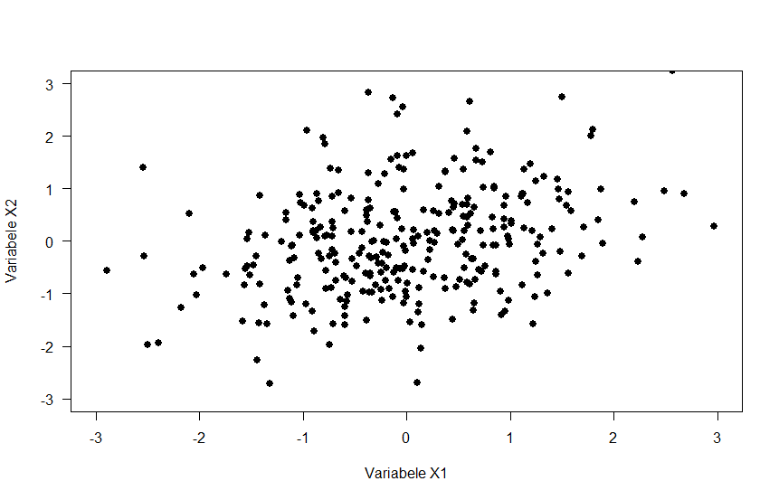 {width = 30%}
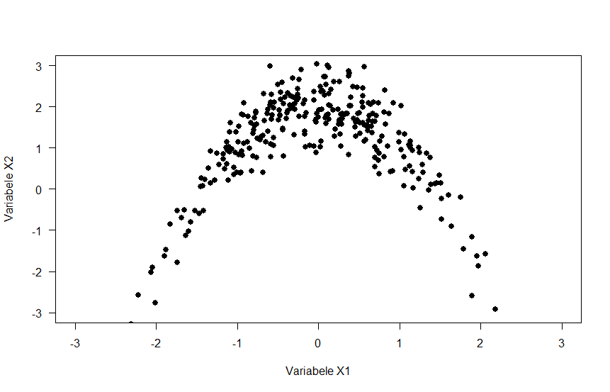 {width = 30%}