9.2 Plotting regressions
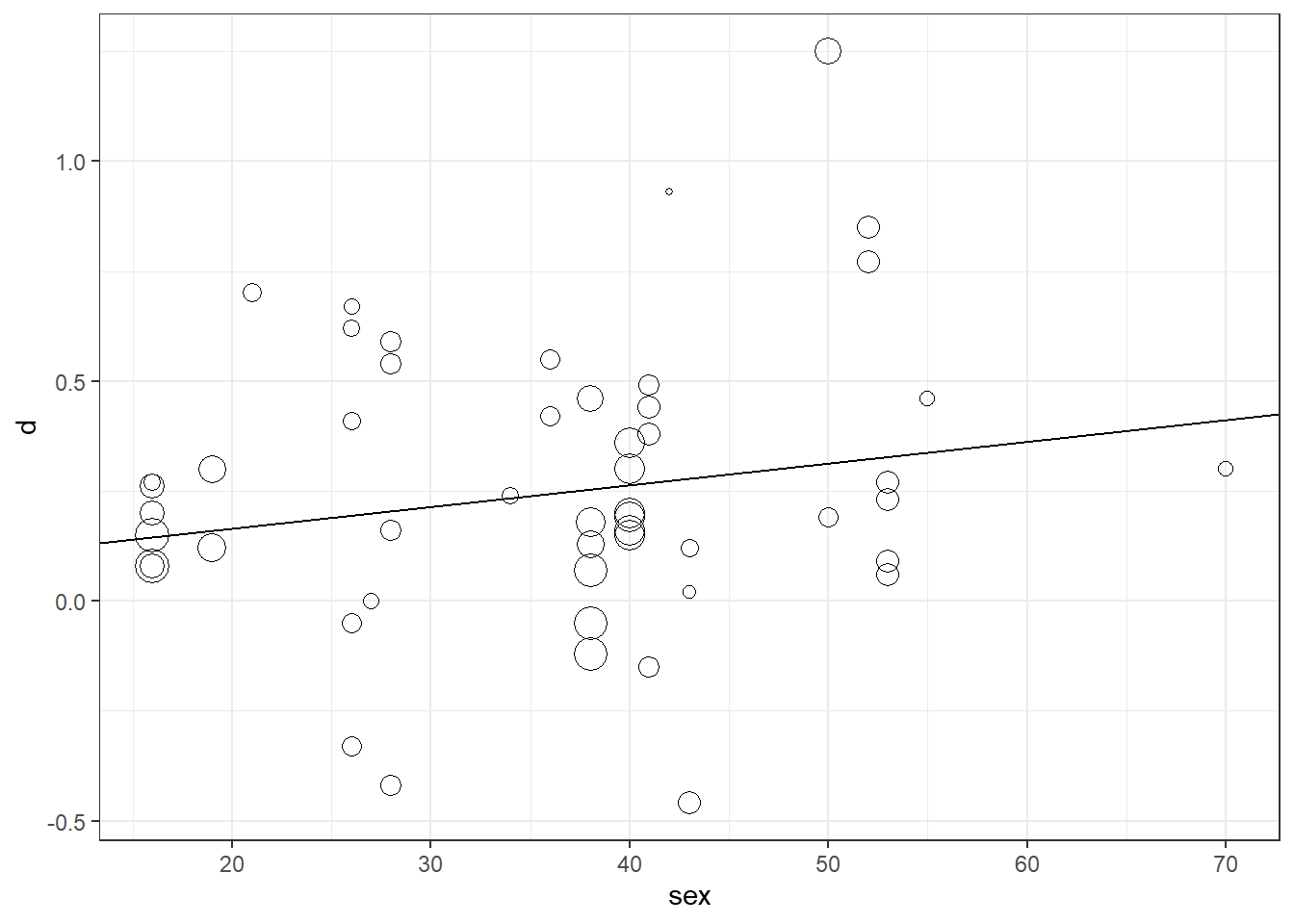
To plot our meta-regression output, we can make a bubble plot using ggplot. This is essentially a weighted scatter plot, where the size of the scatter is mapped to the inverse SE of each effect size, which means the area of the scatter is proportional to the inverse variance:
library(ggplot2)
df$weights <- 1/sqrt(df$vi)
# Specify basic plot, mapping sex to the x-axis, effect size 'd' to the y-axis,
# and 'weights' to the weight parameter.
ggplot(df, aes(x = sex, y = d, size = weights)) +
  geom_point(shape = 1) + # Add scatter
  geom_abline(intercept = m_reg$b[1], slope = m_reg$b[2]) + # Add regression line
  theme_bw() + # Apply black and white theme
  theme(legend.position = "none") # Remove legend