1.4 Plotting the data (optional)
It is always a good idea to look into your data visually. For example, you would like to know the relationship between two specific variables in your data, the distribution of values, and more.
We will introduce three basic functions for plotting data. After you run these functions, the output appears in the Plots tab at the lower right pane.
For plots, we use the ggplot2 package. If the package will not load when you run the code below, you may have skipped some essential steps in 1.1.3.
library(ggplot2)1.4.1 A histogram
Are you curious about how the values of a continuous variable are distributed? Drawing a histogram is one way of examining the distribution.
# Set up the data for the plot and select the variable to plot using aes:
ggplot(data = LifeSat, aes(x = LifSat)) +
  geom_histogram() # Add a histgram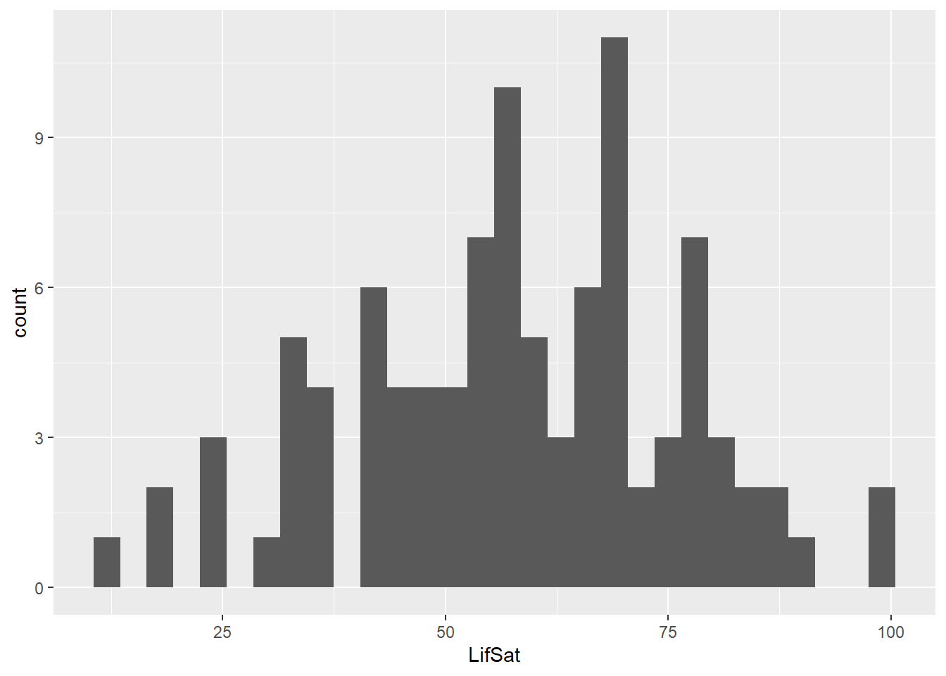
1.4.2 A boxplot
A boxplot shows you how the data are dispersed from the median and whether the outliers exist. Let’s draw the boxplot of the variable, LifSat. Can you guess how to do this?
# Same set up as in the previous example:
ggplot(data = LifeSat, aes(x = LifSat)) +
  geom_boxplot() # Add a boxplot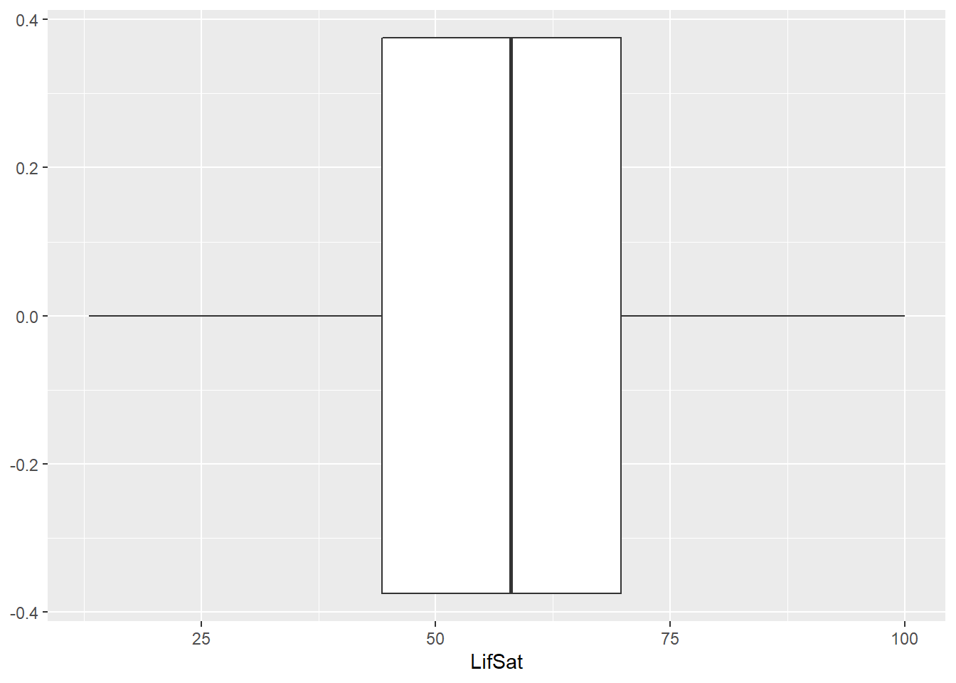
1.4.3 Scatterplot
What if we are interested in visually investigating the relationship between two variables, LifSat and age, in the data? One possible solution is to draw a scatterplot. In addition to the x variable from the previous examples, we can also specify a y variable:
# Set up the data for the plot and select the variable to plot using aes:
ggplot(data = LifeSat, aes(x = LifSat, y = age)) +
  geom_point() # Add scatter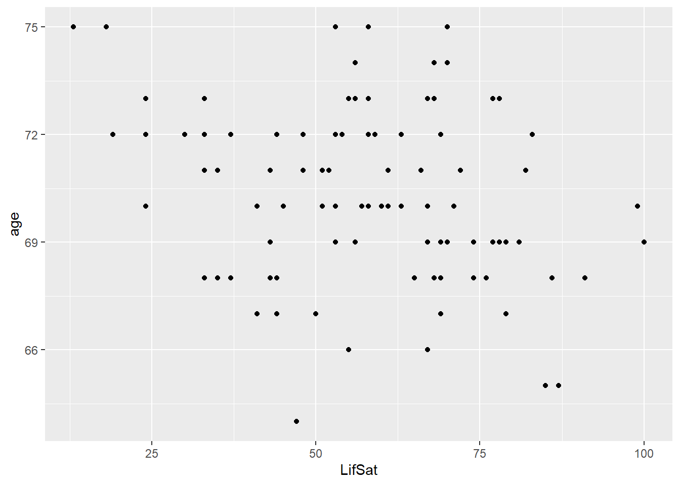
This code gives you the scatterplot of the two variables, LifSat and age. The variable, LifSat, is at the x-axis and the variable, age, is at the y-axis.
1.4.3.1 Analyze your data
- One of the strengths of R is its flexibility in running statistical analyses and producing graphical outputs. In the first week of the course, we will perform some standard analyses in R that you are already familiar with from previous courses.